Blog Post
Using SAS to Create Novel Data Visualizations
February 7, 2017
Ryan Bailey, MA is a Senior Clinical Researcher at Rho. He has over 10 years of experience conducting multicenter asthma research studies, including theInner City Asthma Consortium (ICAC) and the Community Healthcare for Asthma Management and Prevention of Symptoms (CHAMPS) project. Ryan also coordinates Rho’s Center for Applied Data Visualization, which developsnovel data visualizations and statistical graphics for use in clinical trials.
Shane Rosanbalm, MS, Senior Biostatistician, has over fifteen years of experience providing statistical support for clinical trials in all phases of drug development, from Phase I studies through NDA submissions. He has collaborated with researchers in several areas including neonatal sepsis, RA, oncology, chronic pain, hypertension, and Parkinson’s disease. He is the lead SAS developer on Rho’s Center for Applied Data Visualization, where he develops tools and publishes on best practices for visualizing and reporting data.
This is the third in a series of posts introducing open source tools Rho is developing and sharing online. Click here to learn more about Rho’s open source effort.
In our last post, we introduced Webcharts, one of our many interactive web-based charting tools that uses D3. In addition to the many web-based tools that Rho has on GitHub, we also maintain a number of SAS®-based graphics repositories. In fact, our strong reputation for clinical biostatistics and expertise with SAS (and SAS graphing tools) long predated our development of web graphics.
A sampling of some of our SAS tools is provided below, but we invite you to visit GitHub and check out our full offering of SAS tools. You can use the Find a repository… Search bar to search for “SAS”. All of our SAS repositories begin with “sas-“.
Codebook


The SAS codebook macro is designed to provide a quick and concise summary of every variable in a SAS dataset. In addition to information about variable names, labels, types, formats, and statistics, the macro also produces a small graphic showing the distribution of values for each variable. This report is a convenient way to provide a snapshot of your data and quickly get to know a new dataset.
Violin Plot

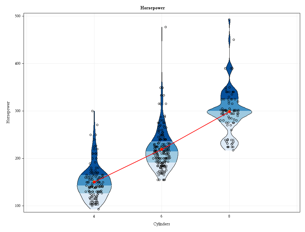
The SAS violin plot macro is designed to allow for a quick assessment of how the distribution of a variable changes from one group to another. Think of it as a souped-up version of a box and whisker plot. In addition to seeing the median, quartiles, and min/max, you also get to see all of the individual data points as well as the density curves associated with the distributions.
Sankey Bar Chart

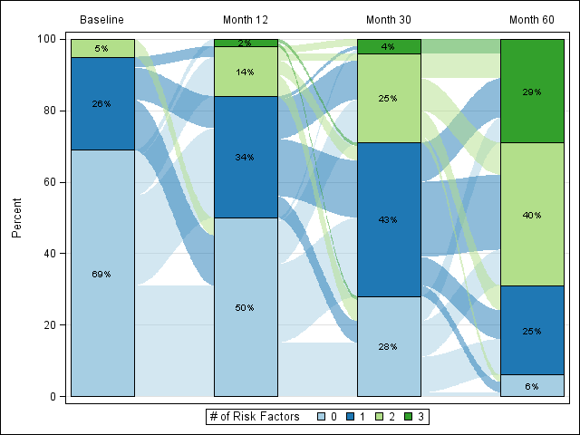
The SAS Sankey bar chart macro is an enhancement of a traditional stacked bar chart. In addition to showing how many subjects are in each category over time, this graphic also shows you how subjects transition from one category to another over time.
Other SAS graphics tools include a Beeswarm Plot (a strip plot with non-random jittering) and the Axis Macro for automating the selection of axis ranges for continuous variables. We are adding new SAS repositories frequently. We invite you to try the tools, share your feedback, and contribute to the development of the tools.
