Home / Explore Insights / A Hands-Free SAS Axis Macro
/ Insights / Explore Insights / A Hands-Free SAS Axis Macro
A Hands-Free SAS Axis Macro
When creating charts and graphs, it is easy to focus on the style and layout of the core data elements but overlook the layout of the axes. It’s an honest mistake, but the result can be painful to look at. A great visualization can be ruined with poorly designed axes – a bit like wearing a tuxedo with sweatpants.
While aesthetics are important, the real threat with poor axes is the potential for miscommunication. Axes set the parameters of our visualization; they provide the context in which we interpret the data. If they are not carefully designed, the data may be misleading or outright deceptive, as in the example below.
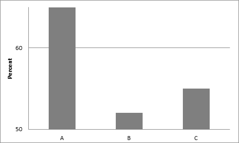
Example: Poor chart axes
This chart is short on information but long on confusion. Why does the y-axis begin at 50? On this scale, the differences between groups appears more dramatic than it would on a scale that (more appropriately) begins at 0. Where does the y-axis end? Does column A run off the chart or end in the visible space? This chart suffers from numerous shortcomings, but the poorly designed axes pose the most glaring challenges to our ability to interpret the data correctly.
Given the pitfalls that come with designing effective axes, many charting programs try to automate axis settings to take the burden of set up off the user. While this is well-intentioned and can work for very basic figures, we often find that the default settings require multiple modifications to create useful figures.
Such is the case with two popular SAS graphing tools – SAS/GRAPH and ODS Graphics. There are many situations in which the default axes produced by SAS/GRAPH and ODS Graphics cannot be used as is.
Perhaps there are too many or too few tick marks for our tastes. Perhaps we need the axis ranges to be identical across a set of graphs for cross-chart comparisons. Perhaps we have a reference value that we wish to display, but this value is outside of the observed data range. For these reasons and many more, we often need to modify our default axis ranges.
Modifying axis ranges in SAS is typically an intensive manual process. First we have to review our graphs, decide what new axis ranges to use, and then type them into the programs. This is not just a one-time challenge, however. With each update to our data set, we run the risk of our previously-specified ranges being out of sync with the new data. Both the cost and risk associated with this manual process are unacceptable.
To aid with axis creation in SAS, Center for Applied Data Visualization developed the %FigAxisOrder SAS macro to create axis ranges based on user-defined criteria. The macro scans the data to be graphed and produces recommended minimum, maximum, and increment values for the axis. The macro’s default behavior is to try to duplicate the axes that we would get out of ODS Graphics. The programmer can then customize the behavior of the macro further by specifying multiple variables to consider simultaneously, specific values that should be included in the axis range, a desired number of tick marks to display, and more. The end result is an axis range that is data-driven, user-configurable, and after the initial setup is maintenance-free.
The %FigAxisOrder SAS macro and accompanying documentation are freely available on Rho’s public graphics-sharing website: graphics.rhoworld.com.
You can read more about Rho’s Center for Applied Data Visualization.

